Dashboard & Statistics
What it does
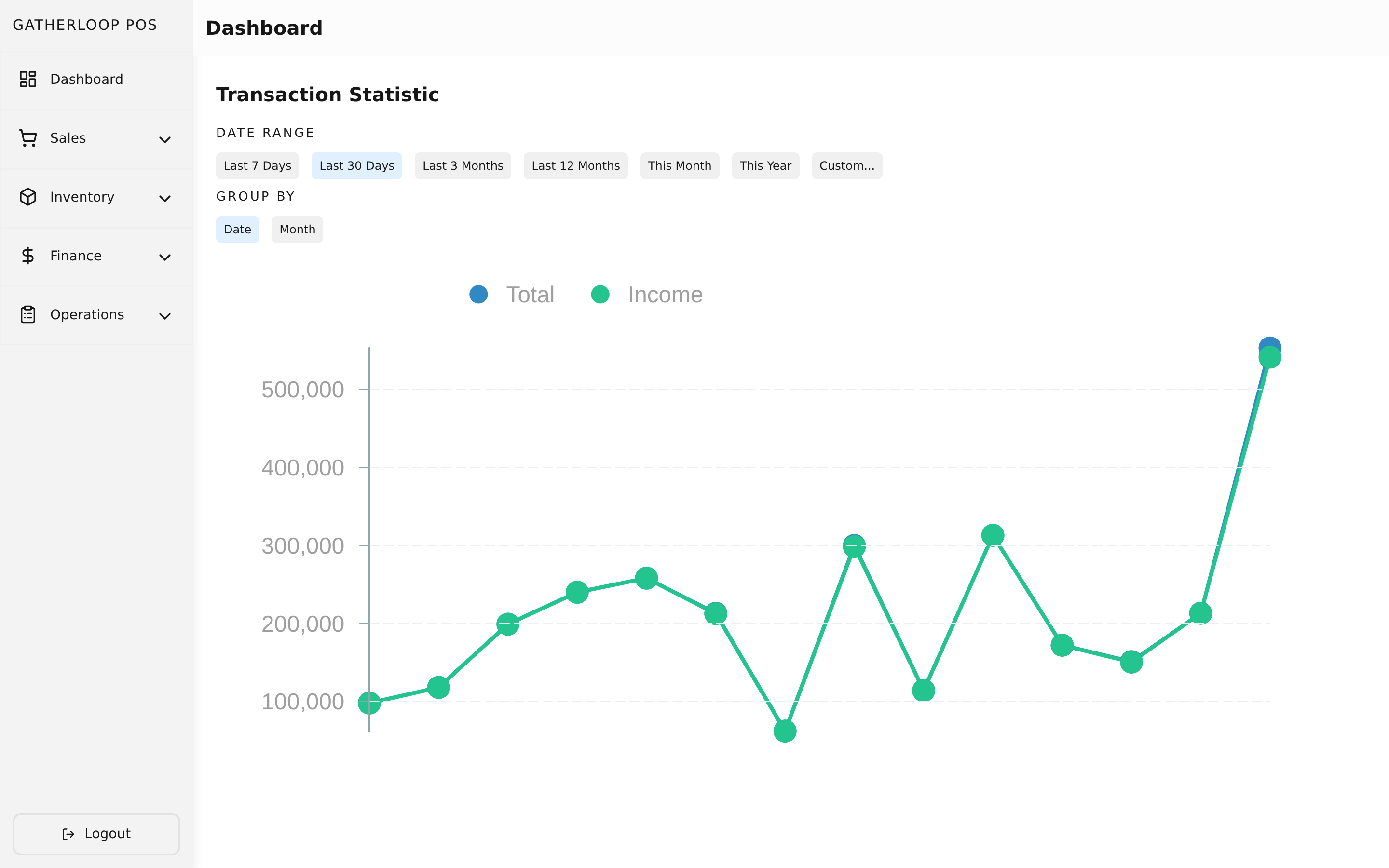
The dashboard is the first thing anyone sees after logging in. It hosts two independent charts stacked on one page: a Transaction Statistic widget (how much is being sold, and how much of it is actually collected) and an Expense Statistic widget (where the money is going, and whether spending is on-plan).
Both widgets share the same shape of controls. A date range can be picked from quick presets — Last 7 Days, Last 30 Days, Last 3 Months, Last 12 Months, This Month, This Year — or set as a custom start/end range. A Group By toggle (Date or Month) controls how finely the chart buckets the data, independent of the range, so a 12-month view can still be inspected day-by-day if needed. Every selection is written into the page URL, so a specific view — "expenses by budget, last quarter, grouped by month" — is bookmarkable and shareable, not lost on refresh.
The Expense widget adds a second toggle, By Budget vs Combined: By Budget draws one colored line per budget category (Restock, Salary, Operational, …) so category-level trends are visible at a glance; Combined collapses them into a single total-spend line. Below the chart sits a Target vs. Actual table: for each budget, its target percentage of revenue (set on the budget itself), the actual percentage it consumed in the selected period, and the difference — with over-target rows called out visually. A footer row shows the implied Unspent/Profit percentage.
Why it matters
A shop owner doesn't have time to page through raw transaction and expense lists to answer "are we doing okay this month?" The dashboard collapses that into two charts and one table: the sales line shows growth or decline at whatever granularity matters, the "Income" line shows what actually landed in a wallet after payment fees (not just what was rung up), and the Target vs. Actual table is the direct answer to "is Restock spend still under 30% of revenue, or is it creeping?" That last question is exactly what turns budgeting from a wish into something an owner can actually check.
Screenshot
Key capabilities
- Transaction chart — Total (gross sale amount) and Income (amount actually collected, net of payment fees) plotted over the selected range, with hover tooltips and a legend.
- Expense chart — spend plotted By Budget (one line per category) or Combined (one total line), toggled instantly with no reload.
- Flexible date ranges — quick presets or a validated custom range, independent for each widget so sales and expenses can be inspected on different windows at once.
- Date vs. Month grouping — choose the right resolution for the range being viewed.
- Target vs. Actual table — target % (from the budget), actual % of revenue spent, and the delta, with over-target categories highlighted; a footer shows overall Unspent/Profit %.
- Shareable views — every filter is encoded in the URL.
- Historical integrity — a deleted budget still shows up correctly in past periods' charts under its original name, so removing a category never rewrites history.
For engineers
- Web route:
apps/pos-web/src/pages/index.tsx - Screens:
libs/ui/src/presentation/screens/DashboardScreen.tsx,TransactionStatisticScreen.tsx,ExpenseStatisticScreen.tsx(+ Handlers) - Components:
libs/ui/src/presentation/components/transactions/TransactionStatistic.tsx,libs/ui/src/presentation/components/expenses/{ExpenseStatistic,ExpenseVarianceList}.tsx - Entities:
libs/ui/src/domain/entities/{TransactionStatistic,ExpenseStatistic,TransactionStatisticDateRange}.ts - Backend:
GET /transactions/statistics,GET /expenses/statistics—apps/api/domain/{transaction_usecase.go,expense_usecase.go}, SQL inapps/api/data/mysql/{transaction_repo.go,expense_repo.go} - Design docs:
docs/prd-dashboard-date-range-filter.md,docs/prd-expense-statistics.md - Related: Expenses and Budgets for what feeds the expense chart and variance table